|
For this assignment, I was told to create 3 different versions of my logo. I used the shape tool, and text function. I used the shape tool to create the circle around my letters, and the text function to fill in with letters. First, I created 4 circles. Then, I added a larger circle with a darker shade behind the first circle to create a shadow look. Lastly, I organized, and added the letters on top of the circles. I think that the most challenging thing about this was lining up the two circles so that they matched up correctly. Although there were certain difficulties I faced while creating my logo, I think it turned out pretty neat at the end. 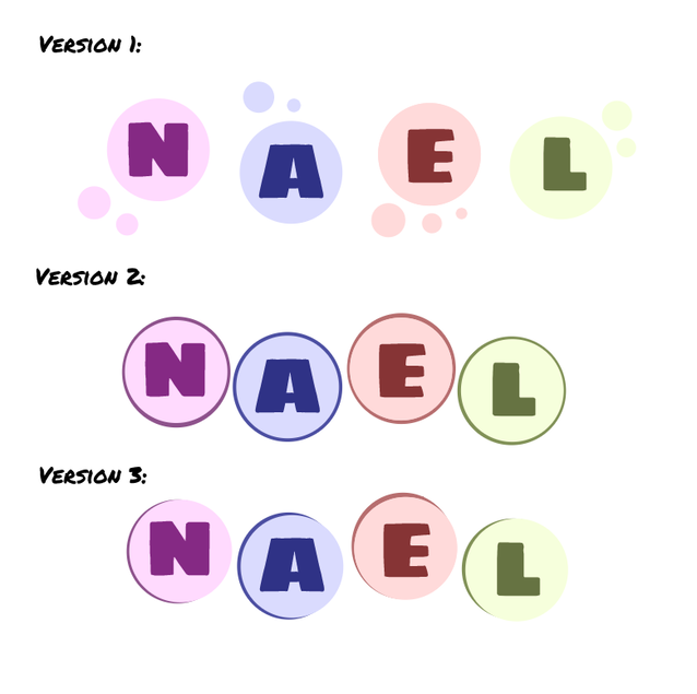 The name of my brand is "Nael's Bubblegum Factory" I decided to create my logo like this because I wanted to give the sense that it was related to "bubbles". Each of letters in my name is in a bubble, with other smaller bubbles around it. This logo represents by brand because it shows that it is colorful, and explains how it relates. to my brand of bubblegums. I think that this logo is my personal favorite of all three examples because it really helps to make. the letters stand out more, as it gives it more attention. the other two has a shadowy look, whereas this one is more spread out. 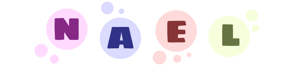
0 Comments
Leave a Reply. |
Archives
May 2021
Categories
All
 This work is licensed under a Creative Commons Attribution-NonCommercial-NoDerivatives 4.0 International License. |
 RSS Feed
